
Designing an Augmented Reality Experience For Life Science

OVERVIEW
Explore a lab instrument in a working lab space before committing to purchase
In February 2020, right before the pandemic hit, Bio-Rad Laboratories wanted a way to bring the QX ONE PCR system into lab spaces using Augmented Reality (AR) for product demos as part of their new marketing strategy. The collaboration between Bio-Rad’s product marketing team and Digital Creative Associates (DCA) formed the perfect synergy needed to execute this exciting, new launch.
PCR systems like the QX ONE are some of the core tools used in every genomics lab. They copy (or amplify) DNA which is then used in different types of research to understand the complex workings of biology.
With the eventual global shutdown due to the pandemic in March 2020, Bio-Rad’s marketing strategy would prove to be prescient and necessary as travel became prohibited and in-person gatherings stopped taking place altogether.
My role
I was the sole Product Designer on an interdisciplinary team consisting of creatives and engineering from Digital Creative Associates (DCA) and product marketing from Bio-Rad.
THE TEAM
Bio-Rad Laboratories:
Jennifer W. - Director of Global Marketing Programs, Digital Biology Group
Aki U. - Global Marketing Manager
Jheremy T. - LSG Web Program Manager, Marketing Solutions
DCA:
Tyler K. - Founder
Nate W. - Art Director
Vince N. - Producer
Sven H. - Engineer
Michael N. - 3D animator
Natalie K. - Product Design
TOOLS & METHODS
What worked?
Status updates
Weekly Zoom meetings with Bio-Rad
Trello
Research & Synthesis
User interviews
User journey map
Comparative analysis of other AR apps
Design artifacts (Figma)
User flow
High fidelity storyboarding & prototyping
Annotations
Asset libraries
Style guide
Marketing documentation
Copy and branded marketing assets for search optimization in the App Store
Testing
Usability tests with the prototype
Beta in Testflight
GETTING TO KNOW THE USERS
How do research scientists buy lab equipment?
To understand the user needs of a research scientist who is shopping for a high-end lab instrument like the QX ONE, I wanted to know more about how scientists go about making purchases for their lab. I interviewed a couple of research scientists and decided to chart user sentiment (what they felt good about or not and what they felt indifferent towards) during the purchasing process to see what insights I might gain.
It was really challenging to find interviewers in life science in the midst of the pandemic. I was aiming to interview at least five people, but I only managed to find two qualified people. I went about these interviews knowing their answers could be anecdotal and possibly not representative of all researchers’ buying experiences. However, talking with two qualified interviewees is better than talking with none.
My two interviewees were U.S.-based research scientists with different lab roles at different labs. One interviewee was a Principal Investigator running a lab at an academic research facility, and the other was a former PhD research scientist who had worked in academic research facilities for many years. Unfortunately, I couldn’t find any researchers from the private sector who would agree to do a user interview.
My two interviewees independently described the same step-by-step purchasing process I outlined below. They repeated similar pain points involved in the purchasing process but added different details that were relevant to their lab roles and responsibilities.

Charting user sentiment in the purchasing process
Additional information: Journey Map #1, Journey Map #2
OUTLINING THE PURCHASING PROCESS
Step 1: Need for new lab equipment
A research lab, led by a Principal Investigator, runs experiments and publishes peer-reviewed papers to develop a central thesis they want to investigate. Once a research objective is identified, the Principal Investigator needs to hire and outfit the lab with necessary equipment. Sometimes, in the middle of the research work, the team hits a roadblock and cannot move forward without purchasing a specific lab instrument.
Step 2: Define funding source
The Principal Investigator defines a budget for the research based on hiring and lab equipment needs. There is a lot of paperwork and bureaucracy involved in making the equipment purchases fit the grant restrictions or budget line item. This part of the process can take months or in some cases, even years.
Step 3: Define needed features; explore product offerings
The research team learns about new technologies and product features by talking to peers at poster sessions and conferences or by reading publications. It’s important to define the needed features because an instrument may not have every needed feature or be compatible with other instruments in the lab. It takes time to find the right combination of product features. Multi-purpose instruments have a huge sales advantage.
Step 4: Request product demos from vendors
Most academics don’t like dealing with sales reps, so this part of the process is both exciting and uncomfortable. It’s exciting because the research team has defined the features they need and now are looking for the right fit in an instrument. They are eager to solve the problem faced in the lab. During demos, the research team gets to add their input on what works or not for the team.
The deciding factors considered when purchasing include:
The instrument’s exact lab specifications and dimensions to determine where the machine will reside in the lab. (i.e. - Does it need special hookups? Will it require a nearby computer setup?)
Data accuracy
Software ease of use
Product demos happen in three ways:
Sales reps will bring out large instruments and even cranes to install them at the customer’s lab.
Vendors will schedule visits to their demo labs at the company site for prospective customers to check out the instrument.
Vendors ship the instruments to conference locations and demo them at events.
Step 5: Evaluate & purchase
Every research team goes through a different evaluation process of an instrument, but ultimately, the Principal Investigator makes the final purchasing decision. The Principal Investigator then works with a sales representative to write up the purchasing agreement which is flexible and tailored to fit a lab’s unique budgetary constraints (i.e. - for cost sharing between multiple departments).
SYNTHESIS
The purchasing process needs to be timely and efficient
Shorten the time it takes to comparison shop and finalize a purchase
Looking at the user sentiments and reading through my interview notes, I discovered that Principal Investigators are primarily focused on fundraising for their labs which can be painstakingly slow and stressful. Once funding is green-lighted, the comparison shopping phase (which includes product demos) needs to move quickly and efficiently, so the new instrument can be installed and the lab can be up and running as soon as possible.
Key insights:
Info on data accuracy, functionalities, features is very important
Timeliness and responsiveness from vendors is crucial
Minimize lab downtime while waiting to find and buy the new instrument
Trust in peer-reviewed publications and knowledge sharing during poster sessions at conferences
User archetypes:
The key insights helped me develop two user archetypes for whom I considered when making design decisions for this app.

The Decision Maker archetype

The Inquisitive Researcher archetype
THE USER PROBLEM
“I need to maximize my uptime.”
Less disruption to the workflow is key
Research scientists always want to maximize their “uptime” which is the amount of productivity time in a lab. They need to keep daily experiments going, so all instruments need to be running with ample amounts of lab supplies on hand to keep things operating smoothly. Any disruption to the lab workflow is a big loss in time and money.
Product demos are necessary, but they disrupt lab productivity — whether the researcher has to travel to a demo site or an instrument is brought into their lab for a test run. Researchers need to move through the comparison shopping phase quickly and efficiently, so it’s crucial that vendors are responsive once they are contacted.
The global shutdown added a new layer of logistical challenges because scientists could no longer attend conferences or request in-person product demos.
Our app was built around this user story:
As a research scientist, I want to learn more about the QX ONE’s data accuracy and see if the instrument’s dimensions fit my lab bench, so I can help my team make a purchasing decision based on our research goals and lab requirements in a quick, efficient manner.
THE BUSINESS GOALS
Finding more cost-efficient ways to demo the QX ONE
Product demos incur a lot of cost in travel expenses as well as transporting and installing a big, heavy instrument at a prospective customer’s lab or at conferences.
“Sometimes reps bring out large instruments with cranes.” - Catherine B., Principal Investigator
During the pandemic, business operations at Bio-Rad needed to continue and sales reps still needed to serve the needs of prospective customers looking to buy lab instruments. Bio-Rad wanted a way to fulfill product demo requests even though in-person gatherings no longer took place.
SOLUTION OVERVIEW
Allow researchers to visualize and explore the instrument in their lab space using AR
The big idea was to use AR technology to make the experience of buying a lab instrument more fun and engaging, involving less of an upfront sales push, so a sales representative would only be needed to complete a purchase.
This saves the researchers a lot of time spent attending product demos which interrupts their research work, while the business reduces costs on in-person product demos.
Working with engineering to define build requirements
HARDWARE
iOS vs. Android
We built an iOS app instead of Android because Bio-Rad’s primary customer base for the QX ONE is in North America where iOS currently leads the market share of mobile operating systems over Android, year over year, from January 2018 to January 2023.¹
Also, at the start of the project, Bio-Rad wanted to deploy the app as an internal tool for sales reps to use on their company issued iPads and iPhones. Our agreed final deliverable was a handoff of the packaged code to the Bio-Rad team for internal deployment using MobileIron.
With that in mind, our engineer recommended setting these minimum hardware requirements to ensure ARKit would be most stable:
iPad Pro 11-inch, 1st generation or later
iPhone 8 or later
running iOS 11 or later
SCREEN ORIENTATION
Due to limited screen real estate on iPhone devices, Nate, Sven, and I chose to design the app in a locked landscape mode to maximize the amount of screen width available for displaying the 3D model of the QX ONE instrument.
DESIGN DELIVERABLES
My design approach
DEFINING NAVIGATIONAL PATHS
I worked with Bio-Rad’s product marketing team to determine which app features to include that would align with our user story. This helped to inform my user flow.
I chose five as the maximum number of core features, and set these core features as the app’s top-level destinations. I arrived at a limit of five after doing a comparative analysis of different high-traffic apps such as Yelp, Instagram, Facebook, Youtube, Twitter, Spotify, Uber, Lyft, Airbnb, Apple Music, Apple Podcasts, and Apple News. I looked at the number of destinations in their fixed bottom navigation bars and observed that they all have 3-5 top-level destinations except for Facebook. I also took into account Apple’s iOS design guidelines about using a minimum of 3-5 icons for app navigation to ensure tap accuracy; avoid overcrowding; and to keep navigational paths simple within the app.² Any features outside of these five that needed to be in the app were categorized as secondary navigational items.
First iteration
In the first iteration of the app, I designed it to have the following five top-level destinations:
Home
Camera
Specs
Benchtop
Instrument
Place instrument again
Resources
Product info
Kits & assays
Publications
ddPCR overview
Send photo

Original top-level destinations
Under the “Resources” destination, I had a long list of content links. The “Resources” content list was important to Bio-Rad’s marketing team because it provided relevant information about the instrument’s data accuracy and application. However, having the content link out of the app to Bio-Rad’s website did not comply with App Store UX guidelines.
I had linked out to these resources because a lot of them are PDFs formatted for printing or reading on a larger screen like a laptop, desktop, or maybe an iPad. However, the tiny font size and multiple-column layouts of these PDFs would be very difficult (if not impossible) to read on a small iPhone screen.
The first app iteration was rejected due to many violations of the App Store guidelines and not meeting its requirement for “minimum functionality”. The app was initially labeled as “spam” by the app review team.
Second iteration
After the app got rejected, I redesigned the user flow to keep most of the user interactions within the app, so I removed the “Resources” destination. I asked Bio-Rad to choose only 1-2 important white papers with simple formatting to include directly in the app. They chose to include the QX ONE’s application notes, so it became a secondary navigational item on the main instrument view. I placed it there because the user may be interested in reading the application notes when they are checking out the 3D model of the instrument on the screen.
Bio-Rad decided to add “Contact us” in the place of “Resources” because it would be an essential function to contact a sales rep if the user was now using the app on their own without a sales rep present.
Revised top-level destinations:
Close menu
Restart placement
Camera
Send photo
Specs
Benchtop
Instrument
Contact us

Revised top-level destinations
High fidelity prototyping
I went straight to high fidelity prototyping in Figma after working out the user flow because it’s hard to get a sense for how the AR environment would look and feel like without actually seeing and navigating around in something that looks like it. A lot of the user experience of an AR app is in the user’s camera view, so the screen is very dynamic. There are no static pages to navigate, so it didn’t make sense to sketch out paper prototypes or wireframing. I searched for a realistic looking photo of a working lab bench, dropped it into my prototype as the background, and fleshed out the design for the app screens. Prototype review with stakeholders also happened in Figma.
Usability testing
I tested out my prototype to make sure users didn’t run into trouble completing tasks through the various navigational paths in the app. The results weren’t all that comprehensive because I needed more insight on how users felt navigating the app while interacting with AR which requires more visual processing from the user and introduces non-traditional user interactions. In retrospect, beta testing the app was better for some of the usability testing as well.
Defining UI elements
FLOATING PRIMARY NAVIGATION BAR
Placement
I designed a collapsible, floating, primary navigation bar to serve as the container for top-level destinations that need to be accessible from anywhere in the app. Users can minimize the navigation bar for better viewing of the instrument. On an iPad, there’s more screen real estate, so it’s not as important to be able to collapse the navigation bar. However, on an iPhone, the screen is much smaller, so the bar takes up more space in proportion to screen real estate.
The primary navigation bar runs down the right-side of the screen because we read from left to right, so the majority of screen space is dedicated to viewing the instrument. This gives the instrument visual priority as your eye scans left to right.
Also, having the navigation bar vertically on the side of the screen instead of horizontally across the top or bottom of the screen makes it easier for users to reach the icon buttons with their finger or thumb while holding the device up in landscape mode.

1. Collapsed navigation bar 2. Expanded navigation bar
From my observations of other AR apps, most of them also placed primary navigational elements vertically down the right side of the screen, so since I did not see any UX need to reinvent the wheel, I chose the same placement for this app’s navigation bar.

1. JigSpace, 2. Tape Measure, 3. Night Sky
Button style
I used white (#FFFFFF) interface icons on a dark gray (#3E3E3E) background at 90% opacity for all the icons in the navigation bar to ensure WCAG compliance. This color and contrast combination passed at WCAG Level AA with a contrast ratio of 10:69:1 for “graphical objects and user interface components”.³
Choosing the right background color for the bar
There is a lot of motion occurring on the screen while using this app. What every user sees on their screen varies, so there is no fixed background color on which I can base my decision for the navigation bar’s background color. The objects on the screen directly behind the navigation bar might be light, dark, or a mix of light and dark at any given time. For this reason, I needed to choose a background color for the bar that would have enough contrast against any shade of color behind it. I played around with different colors and different shades before I discovered that dark gray pops out no matter what color is directly behind it.
I used 90% opacity for the bar’s background color, so the navigation bar is more pronounced against the rest of the screen but still subtly transparent, so the user can see the full screen without having the bar completely obstruct anything behind it.

Navigation bar pops out against the full spectrum of colors
Using interface icons in the primary navigation bar
To call attention to the primary navigation area, I created more visual interest there by using interface icons which also use less screen space than if I were to use text links. I allowed five icons in the navigation bar with fixed spacing between each icon as well as fixed padding within the bar to avoid overcrowding and ensure tap accuracy.
Icon labels
I chose not to put icon labels in the navigation bar due to limited space. In beta testing, none of the test users explicitly mentioned having trouble navigating the app. However, I bet if I asked a few test users to define labels for each icon, they would have trouble doing so.
I need to update with icon labels and take the guesswork out of navigation for users, especially since the actions are not universally recognized ones like “search” or “home”, etc.
FLOATING SECONDARY BUTTONS
Placement
I placed the floating secondary buttons horizontally across the top of the screen because they only temporarily appear under a few top-level destinations. This leaves the center of the screen clutter-free, so the user can see the instrument without any obstructions caused by UI elements. I left-aligned the secondary buttons across the top of the screen because users read from left to right, and it also frames the screen well, with UI elements anchored in three of the screen’s four corners. The button width and height for these buttons are large enough to ensure tap accuracy.

Button style
I used the same button style (colors and opacity) for the floating secondary buttons that were used in the navigation bar, so there’s visual consistency among all actionable UI elements.
Using text instead of icons for secondary buttons
I used text for all secondary buttons because their actions require longer characters to describe what they do. Also, I wanted to design a button background shape that could be stretched to fit any length of button text.
LOGO
Placement
For branding purposes, the Bio-Rad logo and product name needed to be persistent throughout the app, so I placed it in the bottom-left corner of the screen because users read from left to right. It’s noticeable but not too intrusive.
On an iPad, the bottom of the screen feels like a really awkward place to put any navigation elements because it’s hard to reach when you’re trying to hold the device up horizontally with just one hand. It’s out of reach for your thumb, so you’d have to loosen your grip on the device with one hand while trying to hold it steady with just your other hand. Therefore, I decided to use the bottom area for the logo since it’s just a static image.

Hard to reach area on an iPad for navigational elements
DISPLAYING INSTRUCTIONAL DIALOGUE
Per engineering, I needed to designate an area on the screen for instructional dialogue in real-time as the user places the instrument on a flat surface on the screen. Once the instrument is placed, instructional dialogue does not appear in the app again unless the user chooses to refresh and start over.
Placement
To accommodate this dialogue feature, I placed the instructional dialogue horizontally along the bottom of the screen to allow for longer text length without obstructing the middle of the screen area, so the user can still see the instrument.
Text style
For visual consistency and to ensure WCAG compliance, I gave the instructional dialogue a similar style but slightly less visual weight than navigation elements. The text is white (#FFFFFF) over a dark gray (#4E4E4E) background box with 80% opacity. This color and contrast combination passed at WCAG Level AAA with a contrast ratio of 8:32:1 for “normal text”.⁴ The font size is 11pt to ensure legibility.
Navigational elements have a slightly darker gray (#3E3E3E) background color and more opacity (at 90%) while the instructional dialogue box has a lighter dark gray (#4E4E4E) color with 80% opacity. The difference in shades of gray and opacity levels are a subtle differentiator to establish visual hierarchy between navigational elements and static text. I chose not to use new colors to create differentiation because it would add too much visual noise in addition to all the motion happening on screen.

Area designated for instructional dialogue
Width and height of dialogue box
On an iPhone 8 (which has the smallest screen size), the width of the dialogue box measures about 40% of the width of the screen. Our engineer eyeballed the width and height of the dialogue box to have the same proportions on larger screens like an iPhone X or an 11-inch iPad. We kept the instructional dialogue text length within two lines of text on an iPhone 8, so if it could fit at this smaller screen size, it would display just fine on larger devices.
Alignment
The instructional dialogue box is center-aligned with the screen width and bottom-aligned with the bottom of the Bio-Rad logo to its left. The text within the messaging box is center-aligned with the width of the box.

Dialogue box alignment
Design handoff to engineering
I set up my Figma file for both collaboration with stakeholders and eventual design handoff to engineering which worked well for the collaborators on our small team. I didn’t have to consider handoff to or ensuring design consistency with any other designers since I was the only one on this team.
Version control
I created separate Figma pages for each version of the app as we tested and went back to make changes based on the feedback from stakeholders and test users. This helped me keep track of version history in case stakeholders decided to roll back any revisions; I needed an old asset; or the team needed to revisit a previous version before confirming a decision and sending it to engineering to build.
For each version of the prototype, I devoted a frame on the top layer in Figma for design annotations that could be viewable or not. This way, our engineer could check design specs for every screen in the storyboard as he built the app out. Annotations could easily get switched off when I needed to send the prototype over to stakeholders for review, or if I needed to review the designs myself in Figma Mirror to check for padding, spacing, alignment, etc.
Organizing design assets
I created a Figma page for SVG files to be used by engineering and organized them by version, so I could keep track of UI changes sent to engineering along the way.

The component library is on a separate Figma page for my own design use. It just makes life easier to make a change in one centralized place and have it updated throughout the design.

Annotations & style guide
I started out with a separate page for the style guide with the intention of using it as my design specs for engineering. However, it ended up being used more for me to refer to in the beginning of the project, as I fleshed out font styles for the app. The style guide would be more useful to set visual consistency standards if there were other designers involved, but in this case, there were not.
I ended up incorporating design specs as annotations directly in the designs, all on a separate layer within the same Figma page, so I could switch the view mode on or off as needed in the design process.

I tailored my design handoff to fit how our engineer liked to work when it came time to build the app. Luckily for me, he was very well-versed with using Figma and felt comfortable checking directly in my Figma pages for everything. This worked out nicely for us, as the app came out looking and working 99.9% to spec. (Yeah, Sven!)
Beta testing
Troubleshooting bugs
Nate managed the beta testing phase with Sven (our engineer). Beta testers emailed their list of bugs to Nate who checked for duplications, compiled a bug log, and sent to Sven for troubleshooting. Creating video clips of recorded screen captures of each bug was useful in communicating how to find the bug in order to recreate it and troubleshoot.
This all took place while everyone was in quarantine due to the pandemic, so our testers consisted of a group of about twenty internal Bio-Rad global sales employees. Our testers struggled a lot with the UI of the app’s first iteration. They reported that the task of placing the instrument on a flat surface was really challenging because the instrument would move in unexpected ways when tapping, pinching, or moving your finger over the model. There were also misalignments between what the human eye saw as 3D space versus what the computer calculated as 3D space. For example, if the instrument was placed in front of a wall, the computer wouldn’t factor in the wall when calculating visual distance, so the sizing of the instrument in relation to objects around it appeared way off.
Nate, Sven, and I decided to add clearer UI markers like gridlines to show detected flat surfaces on which a user could place the instrument. We also refined the instructional dialogue to better guide the user as they scanned surfaces with their screen. We continued to log our users’ challenges and tweaked the UI until everyone felt at ease interacting with AR.

When we first started beta testing in Testflight, the app was really unstable and crashed so many times with the slightest tap or touch. We hit a big milestone when the app finally stopped crashing on every iOS version.
Deployment
First iteration
Our first iteration started in February 2020, one month before COVID-19 hit. We sent the packaged code to Bio-Rad for internal deployment in August 2020.
Bio-Rad’s product marketing team originally wanted its global sales reps to use the app to demo the instrument in a prospective customer’s lab space. The agreed upon plan was for DCA to build the app, send over the packaged code to Bio-Rad, and have their team deploy internally as an enterprise app via MobileIron. It took DCA eight weeks to sketch out a design, prototype, build, test, and deliver.
After we sent the packaged code over to Bio-Rad, they discovered MobileIron was no longer available for internal deployment. Nate and I looked into different options for Bio-Rad to still deploy this app internally. We suggested Apple Business Manager to them, but it did not serve their immediate needs and its use was too restrictive.
At the same time, the global shutdown due to the pandemic caused all travel and in-person gatherings to stop, so sales reps could no longer conduct product demos in person. Bio-Rad decided to try and take the code we sent them and submit it to the App Store. It got immediately rejected and labeled as “spam”.
Bio-Rad came back to DCA needing to pivot their goals. They now needed a consumer-facing app that would be available in the App Store. This way, customers could download the app on their own iPhones or iPads and interact with the virtual instrument themselves, instead of relying on a Bio-Rad sales rep to conduct the virtual demo for them.
Tyler and I read the rejection message and wrote a response to the app review team explaining how the app was not spam and actually served a real need in the life science industry for an AR app. The app review team removed the spam labeling as one of their reasons for the rejection and offered us some helpful recommendations:
“Guideline 4.2.2 - Design - Minimum Functionality
It would be appropriate to include additional content and interactive features beyond a single AR model and link to Safari. For example, you may consider allowing users to purchase the product, contact a specialist, request a quote and track the status, as well as other content and features relevant to your app concept.
We encourage you to review the previous rejection correspondence for this app, make the necessary changes to bring it into compliance with the App Store Review Guidelines, and resubmit it for review.”
Thus began our second iteration of the app.
Trading off UX for business decisions
Second iteration
We discussed the app review team’s recommendations with Bio-Rad and together decided not to build out any in-app shopping features. Bio-Rad wanted to keep their “Contact us” function as is — which was simply linking out a “mailto:” to contact a sales representative — because the purchasing process for a lab instrument is very different from typical online consumer shopping, as we’ve learned from our user journey map. Building a shopping cart or “request quote” feature seems like basic functionality that should improve the user experience for a typical consumer-facing app. However, this app isn’t entirely B2C or B2B but somewhere in between, and we are using AR technology to try to solve both a user and business problem with product demos.
The decision to not build out in-app shopping features was also due to the fact that Bio-Rad’s product marketing team needed to make sure all customer contact info would be captured within their own pre-existing sales database and not in a newly created one set up specifically for this app. To create a new sales database for the app, the product marketing team would need to consult with Bio-Rad’s corporate legal team which would turn this project into something much bigger and different in scope.
We worked with Bio-Rad to write an exception note explaining the reasons why a shopping cart and “request quote” within the app were not possible. Bio-Rad approved it, and we included the note in our app submission.
We reworked a lot of the UX based on the app review team’s recommendations. The end product was definitely much better, thanks to the app review team’s feedback. We included the following changes:
Added more interactivity to the instrument
Added more content within the app instead of linking out
Added a tutorial at the start of the app
Improved the marketing copy used for the app description
Designed branded screenshots and messaging exactly to App Store’s guidelines and specs
Adding more interactivity to the instrument
In the first iteration, when a user tapped on one of the seven hot spots on the instrument, a video overlay immediately popped up in three of the seven hot spots.
This created an unexpected interaction for the user since they could not tell which hot spots would launch a video and which ones would not. I redesigned the interactivity with hot spots to be more expected and consistent:
On tap (hot spot): Launch a message overlay showing marketing copy that summarizes the product feature. For product features that had an animated video, the video link is included in the copy, so the user explicitly taps on the video link to launch a video. (This gives the user control over what actions happen on the screen, and the user also knows what to expect.)

Our animators also created new 3D animations for each of the green side doors to provide more interactivity with the instrument when the user taps on one of the side door hot spots.
Adding more content within the app
I made sure all actions take place within the app instead of linking out to Safari. The only two actions that link out are “Contact Us” in the navigation bar and “Send photo”, a secondary function that occurs once the user taps the “Camera” function in the primary navigation bar.
I removed the “Resources” icon on the primary navigation bar that linked out to a webpage on Bio-Rad’s website with a link to white papers relevant to the QX ONE. Instead of linking out to all the documents, I asked Bio-Rad to choose just one or two white papers to display directly within the app. They chose to include the “application notes” PDF, so I added a secondary button to the main instrument view where users can choose to read the application notes within the app as they’re looking at the instrument on the screen.

Brief onboarding tutorial
I incorporated an onboarding tutorial when the user first launches the app. It gives a brief overview of the app explaining how it works and what to expect when using the app.
I sketched a simple user flow for the tutorial on paper and then created high-fidelity mockups in Figma to flesh out the copy, graphics and navigational elements of the tutorial. I designed all the typography and iconography according to Bio-Rad’s brand guidelines.
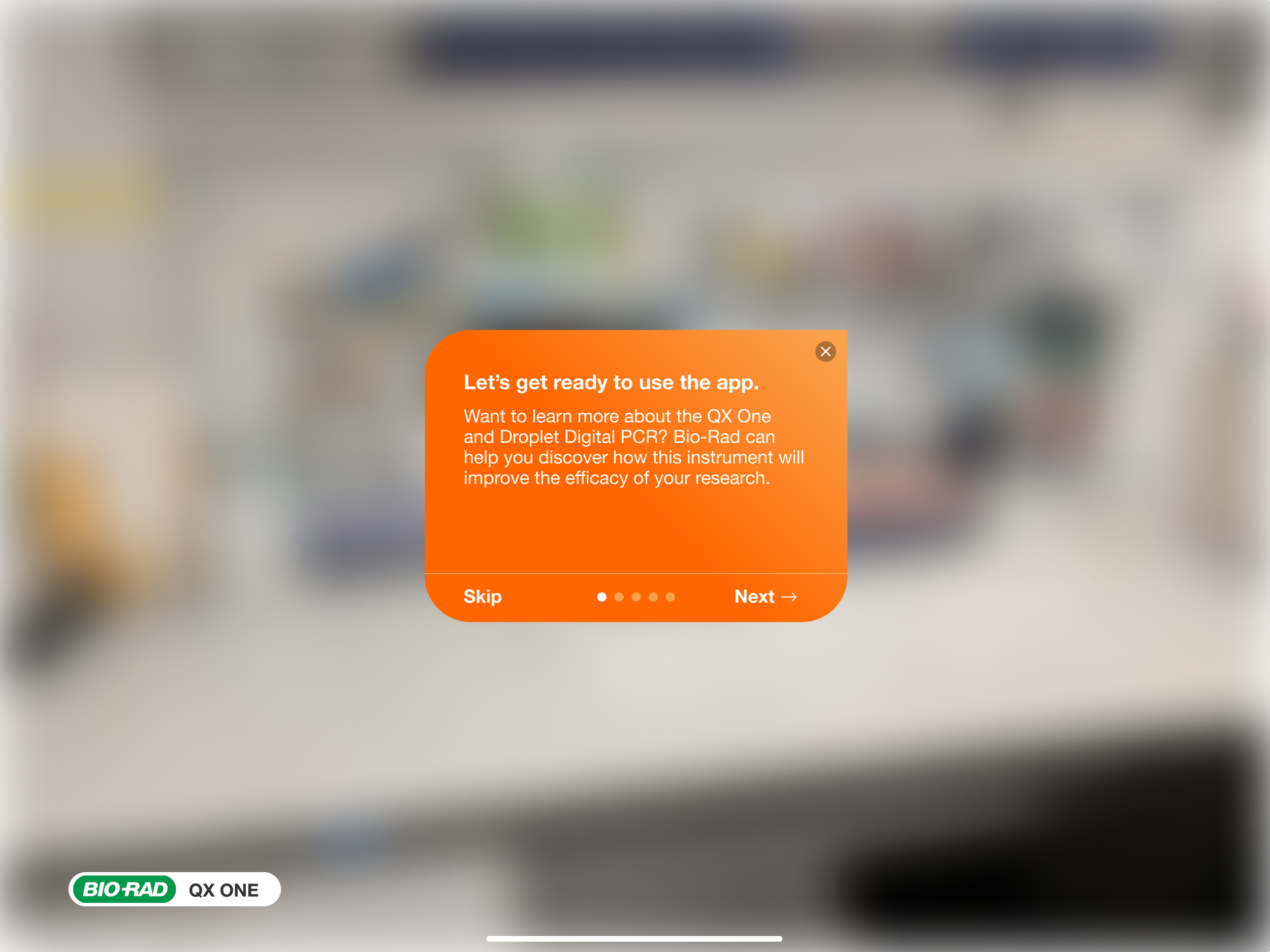
Onboarding tutorial at launch of app
Third time’s the charm
To recap, our first iteration of the app was rejected and called “spam”. The second time we submitted it with a tutorial, we got feedback to build out more interactivity and features. Before we submitted the app for review a third time, we took Apple’s feedback and made a lot of improvements in the app. We also made sure to have Sven, our engineer, submit the code. I designed the screenshots and videos for app submission exactly to the App Store specs. We also included the exception note approved by Bio-Rad. Within 24 hours of our app submission, it got approved… Success!
RESULTS & REFLECTIONS
Conclusion
Augmented Reality is still so new and experimental. It’s been both fun and challenging for me to work on the design for this app, thinking about purposeful ways to harness AR technology. It’s also been interesting to observe how users visually process simulated objects.
Life Science is a good place to use AR because the research world is based on work that is abstract. Although AR isn’t used much in this industry yet, discovering ways to visualize abstract things more concretely helps us understand complex ideas better.
This AR app rethinks how product demos are conducted in the Life Science industry. I’ve learned a lot about designing for AR, but I also walk away with a lot of questions that require time to answer them as Bio-Rad works to introduce the app in more of its product demos. Both customers and vendors are so used to how purchasing lab equipment has worked for a long time now in the Life Science industry. Adoption of an AR app like this one in the purchasing process takes time.
Now that travel and in-person gathering restrictions due to the pandemic have been lifted, it’s important to gain insights on how well the app performs to see if using AR is a viable way for researchers to learn more about lab instruments. The technology also needs to move further along because I suspect AR isn’t going to replace in-person viewing and touching of the instrument unless it can simulate real-life interactions. Having a hands-free experience is essential, so users can reach out and actually interact with the instrument and play around with its software to get a sense of how the instrument really works.
Next steps
I would need to conduct usability tests of this AR app being used by researchers as they do their comparison shopping. This was impossible when I was designing the app because in-person gatherings were still largely restricted. I need to watch a user play around with the app in person to see how they move their hands and body and ask questions as they are doing so to see how they feel about using AR. These observations are impossible to make via a zoom call or with online usability tests that merely track navigational paths and completion rates of more linear tasks.
It would also be helpful to shadow sales reps on product demos without using the AR app. I’d like to see what kinds of questions are asked by researchers when they are considering an instrument. I’d also like to watch how they interact with the instrument when they are checking it out in person.
Answers to some of these metrics would be insightful:
How many app downloads have there been?
How many users tapped the “Contact us” icon?
How many users sent email inquiries originating from the app?
How many emails originating from the app resulted in an in-person meeting? And then how many of these in-person meetings result in closing a sale?
Did using AR in this way help Bio-Rad save time and resources?
I’d also like to create a customer journey map of Bio-Rad’s brand and product experience to understand customer sentiment at each touch point.
Observe scientists using this app in the wild. Is their experience positive, negative, or neutral?
Did using the app help sway them in making their purchasing decisions or not?
Did their perception of Bio-Rad change in any way?
What additional features could be added to this app to enhance the overall experience? Perhaps something like a chat function that could allow researchers to ask questions about the instrument to a live agent?
Does this innovative way of experiencing new lab technologies add value to the company’s branding and reputation? Were customers impressed, or were they indifferent to it?
Building the app is a great start; a lot more needs to go into this over time to make adoption of AR product demos successful.
References
Taylor, P. 2023, January 17. Share of mobile operating systems in North America 2018-2023. Statista. Retrieved April 5, 2023, from https://www.statista.com/statistics/1045192/share-of-mobile-operating-systems-in-north-america-by-month/
Apple Inc. (n.d.). Human Interface Guidelines. Apple Developer. Retrieved March 29, 2023, from https://developer.apple.com/design/human-interface-guidelines/components/navigation-and-search/tab-bars
Institute for Disability Research, Policy, and Practice (n.d.). Contrast Checker. WebAIM. Retrieved March 25, 2023, https://webaim.org/resources/contrastchecker/?fcolor=FFFFFF&bcolor=3E3E3E
Institute for Disability Research, Policy, and Practice (n.d.). Contrast Checker. WebAIM. Retrieved March 25, 2023, from https://webaim.org/resources/contrastchecker/?fcolor=FFFFFF&bcolor=4E4E4E